How to use PgfPlots in latex
本文介绍使用pgfplots来进行绘图的一些方法,日后会随用随更新用例。官方的参考文档:
This article introduces a few commonly used methods for plotting in latex. In this way, there is no need to save picture and include it. Every time when you change your numerical experiment, to update the plot, just need to update the data file.
Before we start, the following packages and command are useful:
1 | \usepackage{tikz} % To generate the plot from csv |
使用 \addplot table 来引入数据绘图
例如 data.dat:
1 | x f(x) |
Using the following commands can generate the plots automatically.
1 | \begin{tikzpicture} |
\begin{axis}... \end{axis}is the environment for a normal axis.- Axis descriptions can be added using the keys
title,xlabel,ylabelas we have in our example listing. - The keys
ymin,ymax,xmin,xmaxcontrol only the visible part, i.e., the axis range. - The third new option is
minor y tick num = 1which allows to customize minor ticks. \addplot[blue]means that the plot will be placed in blue color,\addplot tableloads a table from a file and plots the first two columns. The keywordtablealso accepts an option list (for example, to choose columns, to define a differentcol seporrow sepor to provide some math expression which is applied to each row).
Dealing with multiple files simultaneously
1 | \begin{tikzpicture} |
REMARK:
- We used
\begin{loglogaxis}instead of\begin{axis}in order to configure logarithmic scales on both axes. - The plot contains grid lines since we used the
grid = majorkey. - A legend can be provided for one or more
\addplotstatements using thelegend entrieskey. pgfplotsaccepts more than one\addplot ... ;command, so we can just add our remaining data files.- We do not need to worry about the line styles, since
pgfplotswill automatically choose styles for that specific plot.
使用.csv文件
1 | \begin{tikzpicture}[scale=.8], |
在axis中添加参数: table/col sep = comma
或者在add plot中添加参数:
\addplot table[x=year,y=online, col sep = comma] {figure/market_scale.csv};
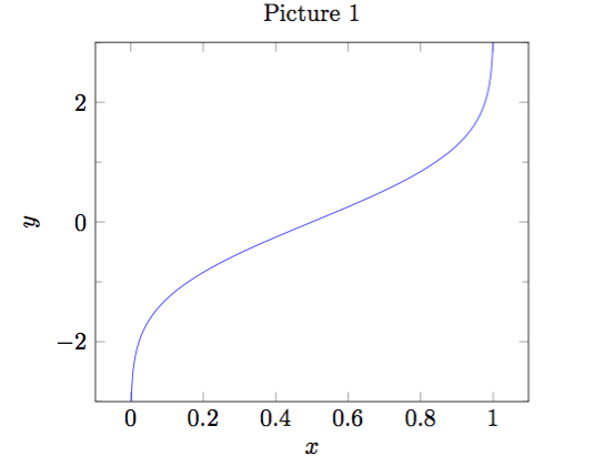
使用 \addplot expression 来绘制函数
1 | \begin{tikzpicture} |
The above commands can obtain the following plot:
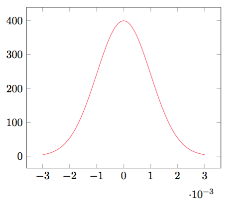
REMARK:
domaindefines the sampling interval in the form a:b.samples = Nexpects the number of samples inserted into the sampling interval.- Here the
expressionis the density of Normal distribution.